Link to the Book: The Fog of Education: How the K-12 Education System Fails Children and Their Families and How the Children Can Save Us!
The identification of student goals begins with an analysis of student data. It is important that the data visualizations used are comprehensive and easy to interpret so that the team does not have to wade through reams of paper to identify key findings. It should be easy for team members to answer key questions and then answer those questions using data and developing findings from the visualization. Key questions could include:
- Are grade levels demonstrating improvement in Math performance over time?
- Do we see improvement in student Math performance across grades within a year?
- Are all of our sub-groups demonstrating improvement in Math performance over time?
- Do sub-groups for all grade levels improve in Math performance over time?
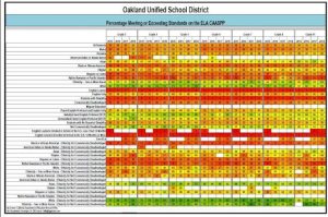
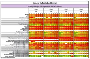
I was able to use state level district data files a long with a python program to create heat mapped data vizualizations of district student academic perfornance on state tests by year, by grade level, by subgroup using a python program to develop the heat mapped data visualization. You can do this as well. Chat GPT will help you to produce the Python script to produce these data visualiations. Below you will find heat mapped data visualizations for the Oakland Unified School Distrct for both ELA and Mathematics, If you produce your own heat mapped datafisualizations.
Please recognize that even if you produce data visualizations like this, most district and school administrators will ignore what they are saying because they are more than willing to blame the victims or claim that the test itself is biased or racist.
As part of your work on the Student Action Team (SAT), you might compel the administration to post data visualizations like this in a public space and on their web site. Data visualizations like this could be used to catalyze a SAT project as well.
Oakland Unified School District
ELA CAASPP Data Visualization
Math CAASPP Data Visualization
That’s a lot of data. Appropriate visualization looks like a major factor for appropriate interpretation!
Agree
Agree